Although the course has now ended, there's still so many things that I can relating both to what I've learnt and the designs I've created.
I've bought myself an A3 ledger (a bargain from Wilko at £4, it's not very thick paper, but it's perfect to mount my work on to and has a lovely texture), and have started to mount my design sheets into it.
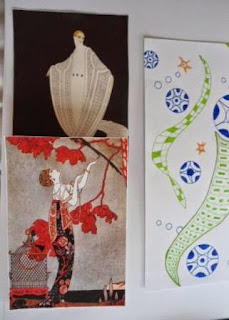
The photos below are of design sheet 1 and the pictures that I used for inspiration.
The picture below is of a section of design sheet 1 in different colours.
I've started a third design sheet, which is based around two circular books that have been mounted directly onto the ledger page. Further work will be done by adding doodles straight onto the ledger page too.
The last three images above are of a blank circular book (they're really easy to make, you just need to cut out your 'pages' in card or paper then sewing them together down the centre, and you have a book!). At the moment, I have only doodles on the front cover of the book and the half circle on the page.
The book in these last images has been made from card that has had the multicolour version of a section of design sheet 1 (see the 5th image from the top of the page) printed onto it. That means that this books has a mixture of blank and patterned pages.
I'll keep adding doodles to the pages in both of these books until they're full, and they'll be a collection of inspirational images that I can peek at when I've not an idea of what to do!
TTFN
Louise


No comments:
Post a Comment